Resize Option
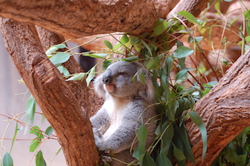
you can control how the image should be resized or moved to match the size of the gallery when using smartphone.
Fit Scale the image to the largest size such that both its width and its height can fit inside the content areaFill Scale the image to be as large as possible so that the gallery is completely covered by the image.
document.addEventListener('DOMContentLoaded',function(){
  new SmartPhoto(".js-smartPhoto",{
    resizeStyle: 'fit'
  });
});
Orientation Api
you can turn off the orientation api so as not to move the image when tilting the smartphone
document.addEventListener('DOMContentLoaded',function(){
  new SmartPhoto(".js-smartPhoto",{
    useOrientationApi: false
  });
});